
Colour wise
This month, I want to talk about paint. I can’t think of a single Castellum project that has not featured paint, or a single person that lives in a house without paint. People have been painting their houses since forever; even cave dwellers used natural pigments to cheer up their caves! Ancient Egyptians (C 3,000BC) used a lime-based whitewash to coat their walls for both practical and ceremonial reasons (these early coatings helped to reflect sunlight and acted as a primitive disinfectant). Ancient Greeks and Romans too used natural earth pigments (mixed with binders like milk and eggs) and the Romans were particularly advanced in using frescoes and decorative painting. Paint was important as a preservative, but it also reflected social standing and indicated wealth.
During the Middle Ages, paint remained largely utilitarian and lime-washes and oil-based coatings were applied by hand. Painting became a skilled trade and techniques such as tempera and fresco painting were refined in more affluent homes and religious buildings. The Renaissance (14th–17th centuries) brought a rebirth in architectural design and interior decoration, particularly among the elite.
As with so many things, it was The Industrial Revolution that saw the birth of modern paint and mass production came about in the late 1800s, making paint more accessible and affordable as synthetic pigments, binders and chemical processes evolved. Painting was, by now, more widely used both for protection of materials like timber, but also for self expression and personalisation and, by the post World War II Boom, there was a massive demand for house paint. The 1950s and 60s saw the introduction of latex and vinyl paint (which made it easy to apply and popular with the DIY market). However, with this, came less welcome advancements: the use of lead (commonly added for durability and colour vibrancy) until it was banned due to health risks and Volatile Organic Compounds (VOCs) which are present in all paints to a certain degree but found in high concentrations in many oil based paints and which release harmful fumes that contribute to indoor air pollution.
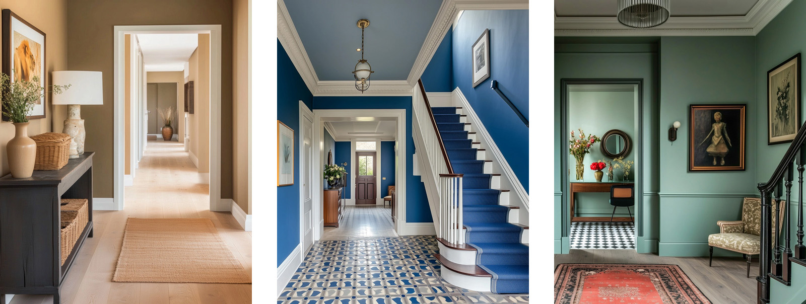
As our awareness of both environmental and health issues grows, we are increasingly making better choices and yet, considering sustainable paint is still relatively low down the list of priorities when it comes to construction.
Today, when it comes to choosing paint, colour is still the first thing people think about (and it is definitely the most fun to consider!) Colour selection has a unique power to influence a space that is nothing short of remarkable. However, what is also worth considering, is the impact of paint that is not immediately visible and, with further technological advancements, we do now have the opportunity to make good decisions with absolutely no compromise on colour choice or
At our recently completed retro-fit project for the Grosvenor Estate, Graphenstone were the chosen sustainable paint supplier and I caught up with Greg Norman, Head of Key Accounts, to talk all things paint. “Graphenstone’s paints have been certified with one of the world’s lowest profiles in C02(e) which includes its significant C02 absorption ability, during the curing process. Our products comply with building standards such as BREEAM, WELL & LEED, while offering unmatched performance. Based on natural minerals, that have been trusted for millennia, Graphenstone offers a greater range of globally recognised harm-free certifications than almost any other brand, tested using rigorous independent analysis.” Greg’s chat is compelling and I find myself wondering why you wouldn’t use it?
Graphenstone have collaborated with English Heritage to offer an expanded house range of 120 shades, an ‘NCS’ range of 980 colours and, if you still can’t find the perfect shade, they can colour match anything. Greg tells me that almost the first thing he is asked about when it comes to talking about his brand is colour. “Colour is the last thing I want to talk about. If you will pardon the pun, we have that covered.”
Greg acknowledges that “A common misconception is that eco-friendly paints don’t perform as well as their traditional counterparts. However, advances in technology mean that many sustainable paints now offer equal – if not superior – durability, colour retention, and coverage. Graphenstone infuse their lime and mineral-based paints with a patented graphene polymer – which transforms the milky lime wash-like base into a paint that is applied and performs just like standard paint – but without the petrochemicals. Switching to sustainable paint is an easy and impactful change. It safeguards your health, protects the environment and aligns with a broader movement toward responsible living – all without having a major impact on cost.” Graphenstone is surprisingly competitive when it comes to pricing.
Canadian Online Gaming Trends According to Casizoid Analysis
Canada’s online gaming landscape has undergone remarkable transformation over the past decade, evolving from a fragmented provincial system into a sophisticated digital entertainment ecosystem. With internet penetration rates exceeding 94% and a tech-savvy population increasingly comfortable with digital transactions, Canadian players have embraced online gaming platforms at unprecedented levels. Understanding these shifting patterns requires examining not only player preferences and technological adoption but also the complex regulatory framework that shapes how Canadians access and engage with digital gaming content. Recent analytical data reveals compelling insights into behavioral trends, demographic shifts, and the factors driving growth in this dynamic sector.
The Evolution of Canada’s Digital Gaming Market
The Canadian online gaming market has experienced exponential growth since the mid-2010s, with annual revenues climbing from modest figures to billions of dollars. This expansion reflects broader societal shifts toward digital entertainment consumption, accelerated significantly by the COVID-19 pandemic when traditional entertainment venues faced restrictions. Provincial governments initially approached online gaming with caution, but gradually recognized both the revenue potential and the necessity of regulated frameworks to protect consumers.
Ontario’s launch of its regulated iGaming market in April 2022 marked a watershed moment for the industry, establishing North America’s largest regulated online gaming jurisdiction. This move legitimized operators who had previously served Canadian players through offshore licenses and created a blueprint other provinces are now examining. British Columbia, Quebec, and Atlantic Canada have maintained their own provincial models, creating a patchwork regulatory environment that shapes player experiences differently across regions.
The demographic profile of Canadian online gaming participants has broadened considerably. While early adopters were predominantly males aged 25-45, recent data shows increasing participation among women, who now represent approximately 40% of regular players, and older demographics, with the 55+ age group showing the fastest growth rate. This diversification reflects improved user interfaces, mobile accessibility, and expanded game varieties that appeal to broader audiences.
Player Preferences and Behavioral Patterns
Canadian players demonstrate distinct preferences that set them apart from their international counterparts. Mobile gaming has become the dominant access method, with approximately 65% of gaming sessions occurring on smartphones or tablets. This mobile-first approach influences game design, payment methods, and promotional strategies that operators deploy to capture market share.
Research conducted by Casizoid indicates that Canadian players prioritize security and licensing information when selecting platforms, with 78% of respondents stating that regulatory compliance significantly influences their choice of gaming sites. This heightened awareness of legitimacy reflects both increased consumer education and the proliferation of resources helping players identify trustworthy operators. Payment method diversity has also emerged as a critical factor, with Canadians showing strong preferences for Interac e-Transfers, which accounted for nearly 60% of deposit transactions in 2023, followed by credit cards and emerging cryptocurrency options.
Game selection patterns reveal interesting regional and demographic variations. Slot games remain the most popular category overall, representing approximately 70% of gameplay time, but table games like blackjack and roulette show stronger preference among older demographics and players in Quebec. Live dealer games have experienced remarkable growth, with participation rates increasing by over 150% between 2020 and 2023, as technological improvements have enhanced streaming quality and interaction capabilities.
Session duration and spending patterns also provide valuable insights into player behavior. The average Canadian gaming session lasts approximately 35 minutes, with peak activity occurring between 8 PM and 11 PM on weekdays and extending later on weekends. Responsible gaming features, including deposit limits, session timers, and self-exclusion options, are utilized by approximately 30% of players, indicating growing awareness of gambling harm prevention measures.
Technological Innovation and Market Dynamics
Technological advancement continues to reshape the Canadian online gaming experience in fundamental ways. The rollout of 5G networks across major urban centers has eliminated many connectivity barriers that previously hindered mobile gaming quality, enabling seamless live dealer experiences and complex game mechanics that were previously impractical on mobile devices. Cloud gaming technology is emerging as a potential game-changer, allowing resource-intensive games to run on any device without requiring powerful hardware.
Artificial intelligence and machine learning algorithms are increasingly deployed for personalization, game recommendations, and responsible gaming interventions. These systems analyze player behavior patterns to identify potential problem gambling indicators and trigger protective measures before harm occurs. While privacy concerns remain, most Canadian players accept data collection when it demonstrably enhances their experience or safety.
Payment innovation represents another significant trend, with cryptocurrency adoption growing despite regulatory uncertainty. Approximately 12% of Canadian online gaming transactions now involve digital currencies, appealing particularly to younger demographics who value transaction speed and privacy. Traditional financial institutions have responded by improving their own offerings, with near-instantaneous bank transfers becoming standard rather than exceptional.
The competitive landscape has intensified dramatically following Ontario’s market opening, with over 50 operators now licensed in that province alone. This competition has driven innovation in user experience, bonus structures, and customer service standards. However, it has also raised concerns about marketing saturation and the normalization of gambling activities, prompting regulatory reviews of advertising practices and responsible gaming requirements.
Regulatory Framework and Future Outlook
Canada’s provincial regulatory approach creates unique challenges and opportunities for both operators and players. Each province maintains jurisdiction over gaming within its borders, resulting in varying licensing requirements, tax structures, and consumer protections. This fragmentation complicates compliance for multi-provincial operators but also allows provinces to tailor regulations to local preferences and concerns.
The federal government’s role remains limited primarily to criminal law aspects, though discussions continue about potential federal oversight frameworks that might harmonize standards while respecting provincial jurisdiction. Anti-money laundering requirements, enforced through FINTRAC regulations, apply nationally and have become increasingly stringent, requiring operators to implement robust verification and monitoring systems.
Looking forward, several trends appear poised to shape Canada’s online gaming landscape. Additional provinces are likely to follow Ontario’s regulated market approach, potentially creating interprovincial agreements that allow players to access wider operator selections while maintaining local regulatory oversight. Esports betting is emerging as a significant growth category, particularly among younger demographics, though regulatory frameworks are still developing to address unique challenges in this space.
Virtual reality and augmented reality technologies, while currently niche, show potential to revolutionize online gaming experiences within the next five years as hardware costs decrease and content libraries expand. Social gaming features that allow friends to play together or compete against each other are also gaining prominence, reflecting broader trends toward connected entertainment experiences.
The Canadian online gaming sector stands at a pivotal juncture, balancing rapid growth and innovation against responsible gambling imperatives and regulatory evolution. As provinces refine their approaches and operators compete for market share, player protection and experience quality will likely determine long-term success. The data clearly indicates that Canadian players are sophisticated consumers who value security, variety, and convenience, expectations that will continue driving industry development in coming years. Understanding these trends provides essential context for stakeholders navigating this complex and dynamic market, where regulatory compliance, technological innovation, and consumer preferences intersect to shape an industry that has become a significant component of Canada’s digital economy.
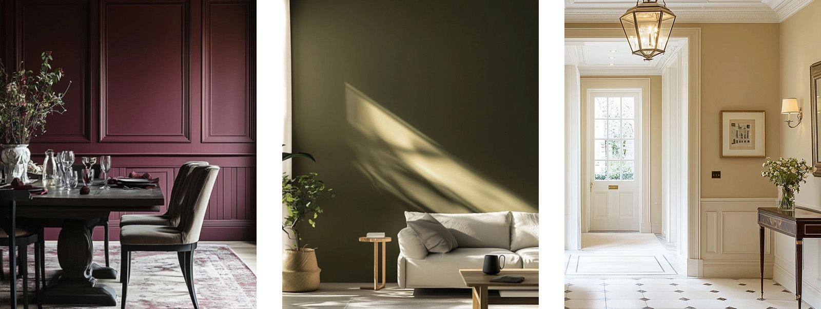
The UK government has been increasingly tightening regulations on building materials to reduce environmental harm. The push toward Net Zero and stricter rules on VOC content in household products align perfectly with the use of sustainable paints. By choosing them, homeowners not only stay ahead of regulations, but also support a growing market for greener alternatives.
Many sustainable paint brands operate under strong ethical principles, using fair labour practices and sourcing ingredients responsibly. By choosing such products, you’re supporting companies that prioritise both people and the planet – a small choice that contributes to a much larger impact. Adopting sustainable paints is a simple, yet effective way to make your home greener. It’s a change you can make without major renovations or expense.

Having said all of that, can we just talk about colour?
- Red is a powerful and attention-grabbing colour. It’s often associated with passion, urgency and danger. This is why red is used in stop signs, emergency vehicles and sales tags. It can raise heart rates and stimulate appetite, which is why many fast-food chains use it.
- Blue, on the other hand, has a calming effect. It evokes feelings of trust, stability and peace. This makes it a popular choice for corporate logos and social media platforms. Interestingly, blue can also suppress appetite, possibly because blue foods are rare in nature.
- Yellow represents energy, optimism, and warmth, but in excess, it can also create feelings of anxiety or agitation. It’s a high-visibility colour, often used to grab attention – think of caution signs and, especially in our world, high vis clothing.
- Green is closely tied to nature and renewal. It’s restful for the eyes and is associated with balance and harmony. Many healthcare and environmental organisations use green for its soothing and reassuring qualities.
- Black signifies elegance, mystery and power, but it can also evoke feelings of sadness or intimidation. It’s often used in fashion to convey sophistication.
- White conveys cleanliness, purity and simplicity. It creates a sense of space and clarity, which is why it’s common in minimalist design and healthcare settings.
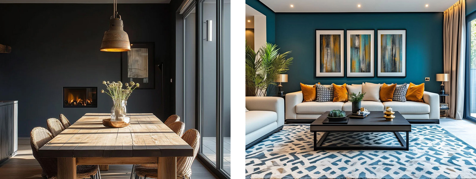
Setting the tone
Luxury doesn’t always mean bold – often, it means carefully curated. The right colour can create a seamless flow from room to room, setting a consistent tone of class and exclusivity.
Maximising architectural features
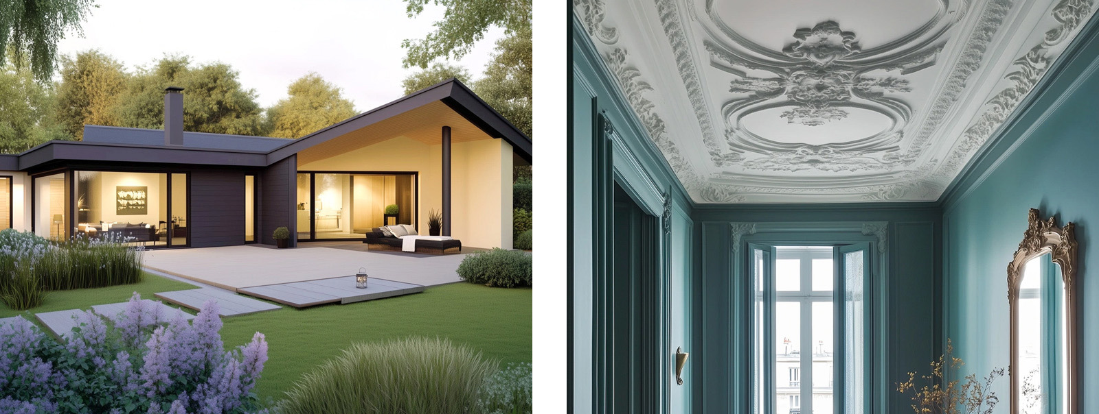
Power play
Creating a narrative
Choosing paint colours for a luxury home is far more than a decorative decision – it’s a foundational aspect of design that affects perception, emotion and value. Colour has the ability to elevate a property from beautiful to breathtaking. It’s the subtleties that count and colour is one of the most powerful subtleties of all. I still can’t think of a single reason not to make that a sustainable choice.

In other news…
This month we have been as busy as ever networking and it has been a treat.
The Banus Cup 2025
June is the month of our annual golf trip to Marbella, Spain; hosted by our Founding Directors, Ben Jones and Chris Wingrove and this year in partnership with ATI and Taskworthy. For the first time this year we had a ladies team and were joined by Ascot Design, Regency Grove, Colliers, BTP, SHH Architecture and Savills. We played three amazing golf courses: Flamingos Golf, Finca Cortesin (which hosted the Women’s Ryder Cup in 2023) and La Zagaleta – sadly a heavy storm cut play short at Zagaleta. Despite this it was, as always, a fabulous trip away with a chance to continue building relationships with like-minded industry professionals.

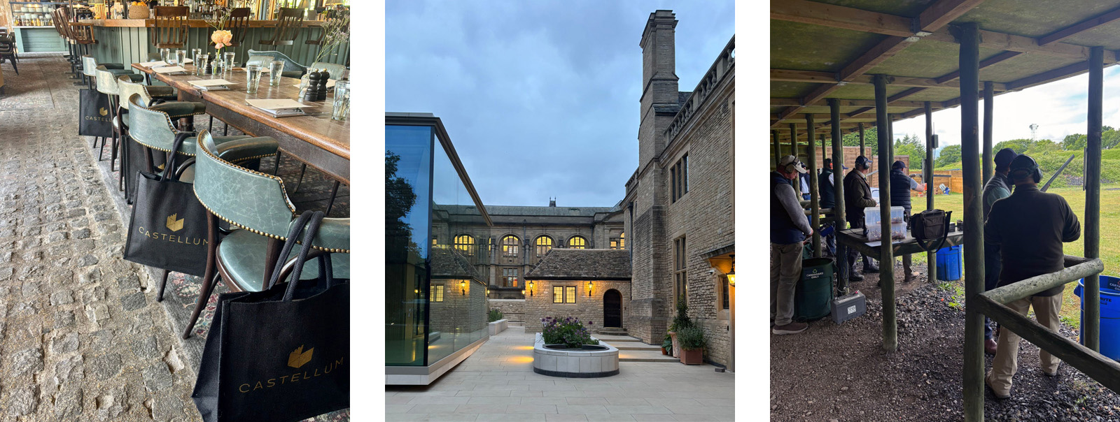
We began the month with a fantastic breakfast hosted by CODE Architecture at Kitchen Architecture, followed by Badminton hosted by Savills with Adam Architecture in tow. We were then lucky enough to attend the Anderson Orr summer party at the beautiful Rhodes House in Oxford. A stunning venue and an extensive guest list made for a truly memorable evening.
Howden invited us along to the superb Barn Theatre in Cirencester as they relaunched their Business Club. With over 50 local businesses in attendance, it was an informal mingle over drinks and delicious canapés, prepared by the team at Teatro (the on-site restaurant which is well worth a visit). We then got to watch their latest production, Educating Rita, which was absolutely superb!
Later in the month, we hosted Corrigan Gore at the Rose Charity Clay Shoot Day at the Ian Coley Shooting School. This revealed some competitive spirit within the Castellum Cotswolds team… Jack Barton, our Project Manager, shot an impressive 41/50, just one point off the top score of the day. Rebecca on the other hand graciously received a generous participation award.
Rebecca also joined the Adair team, alongside Lauren Gilberthorpe Interiors and LA London, at the Construction Industry Dragon Boat Race Challenge. The team missed the semi-finals by just a few seconds, but at least they stayed dry, unlike one team that capsized right by the start line!
We also had the pleasure of hosting Webster Hart, Gunter & Co, SHH and Regency Grove at the Hurlingham Club’s annual polo event. It continues to be a successful event, with the day ending in the Pommery tent surrounded by much of the Prime Residential London community. A lovely breakfast followed at The Ox Barn in the Cotswolds, co-hosted with Cream & Black Interiors and joined by guests from BLDA, followed by an excellent networking event in Oxford hosted by Garringtons with another standout guest list.


We also wanted to introduce you to Reg and Jeff (centre). What a pair of cuties! Reg and Jeff’s human is our Company Accountant, Barrie Luen. Jeff loves going out on his boat and the feel of the wind in his ears!
Fifi, Jet (left and right) and Lollie (below), not to be outdone by Reg and Jeff, have also been posing for photos this month.
On a final, and rather more serious note, our first aid training came to the fore this month; thankfully not on one of our sites. At Castellum we take Health and Safety very seriously indeed and, with that, we undertake a great deal of training and always have a First Aider or two on every project. In the Cotswolds, given the rural locations of our sites, we have recently installed AEDs on every project and many of our team have just had refresher training in using a defibrillator. Jack, one of our PMs, was called upon to help a young man in the gym who had collapsed. Jack is well known in the gym and he will modestly tell you that he was in the right place at the right time – but we all think he is a hero! Using the AED, Jack kept the chap alive until the air ambulance arrived. We are happy to report that he survived and the latest report was that he was recovering well in hospital. Go Jack! (For the avoidance of doubt, Jack is the human featured bottom right).

